on
Back to basics.
I’ve now spent few weeks getting my head around Data Driven Documents and it has proven yet again the importance of understanding the basics.
Tools and libraries have always been essential part of software developments, but they all have their limits. The easier it is to use a software library or tool, the more limited they are. And the more time is spent on learning and using a particular library or tool – the harder it is to use a different one. You get more boxed-in and risk ending up as a “total cardboard box” as we say in Iceland, or “algjör pappakassi”.
The D3 library is a transformation, if not a revolution in library design.
Unlike most libraries, the focus is fundamental and objective. That is, instead of an API for a line chart for example, you have an API for an x-axis, y-axis and a line.
The downside is that you can’t impress anyone after couple of days work or even two weeks work. So it’s not the right tool for the fancy dashboard that needs to be delivered in couple of weeks.
The upside however is that because it’s designed to make use of web technology, SVG to be specific, any new functionality is immediately available. Less risk of ending up as a total cardboard box.
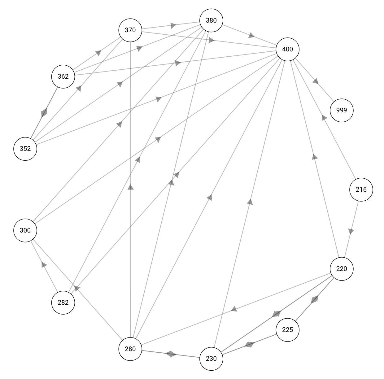
A common challenge in E1 and source of confusion, is status flow, like purchase order flow for example. I decided therefore to have a go with it in D3. After fruitless search for a stock-standard graph type, I ended up with the simple one above. It’s no-frills and unlikely to impress in a power-point. But it gives a good idea of idea behind D3, which is to build the graphs from basic shapes – fundamental and objective.
The above graph is made from lines, or links that represent status-flow, circles for each status and text with each status code. And this is exactly how you do this in D3:
Start by drawing the links:
    // Links
    g.selectAll(".link")
      .data(this.data.flow)
      .enter().append("path")
      .attr("class", "link")
      .attr("d", d => {
        let from = this.project(this.data.status.indexOf(d[0]));
        let to = this.project(this.data.status.indexOf(d[1]));
        let halfTo = [(from[0] + (to[0] - from[0]) / 2), (from[1] + (to[1] - from[1]) / 2)];
        return `M${from}`
          + ` L${halfTo}`
          + ` L${to}`;
      });
Then draw the status circles with the text:
    // Nodes
    let nodes = g.selectAll(".node")
      .data(this.data.status)
      .enter().append("g")
      .attr("class", "node")
      .attr("transform", (d, i) => {
        return `translate(${this.project(i)})`;
      });
    nodes.append("circle")
      .attr("class", "status")
      .attr("r", 25)
    nodes.append("text")
      .attr("class", "label")
      .attr("dy", ".31em")
      .text(d => { return <string>d; });
And that’s it!
There is a little bit more involved in getting the data ready and some geometry, but these 30 odd lines are the core function.